The global race to press print
The secret anatomy and psychology of letters
Fonts that rule our streets and skies
The modern battles of digital type

streetspirit American engineers debuted Highway Gothic in the 1940s. In 2004, designers launched Clearview to stop headlight glare on reflective signs, giving drivers crucial extra seconds to react.
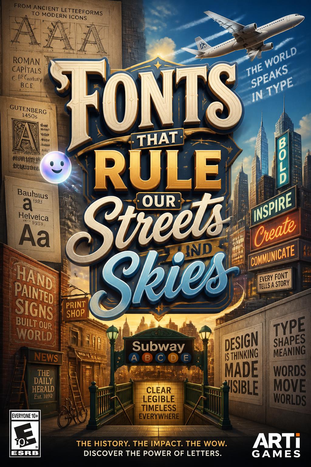
streetspirit Match fonts to highways and airports to discover how letters secretly keep us safe.
streetspirit For Paris Charles de Gaulle Airport, Frutiger shaped letters with wide openings for instant readability. This revolutionary design now guides rushed travelers in transit hubs worldwide.
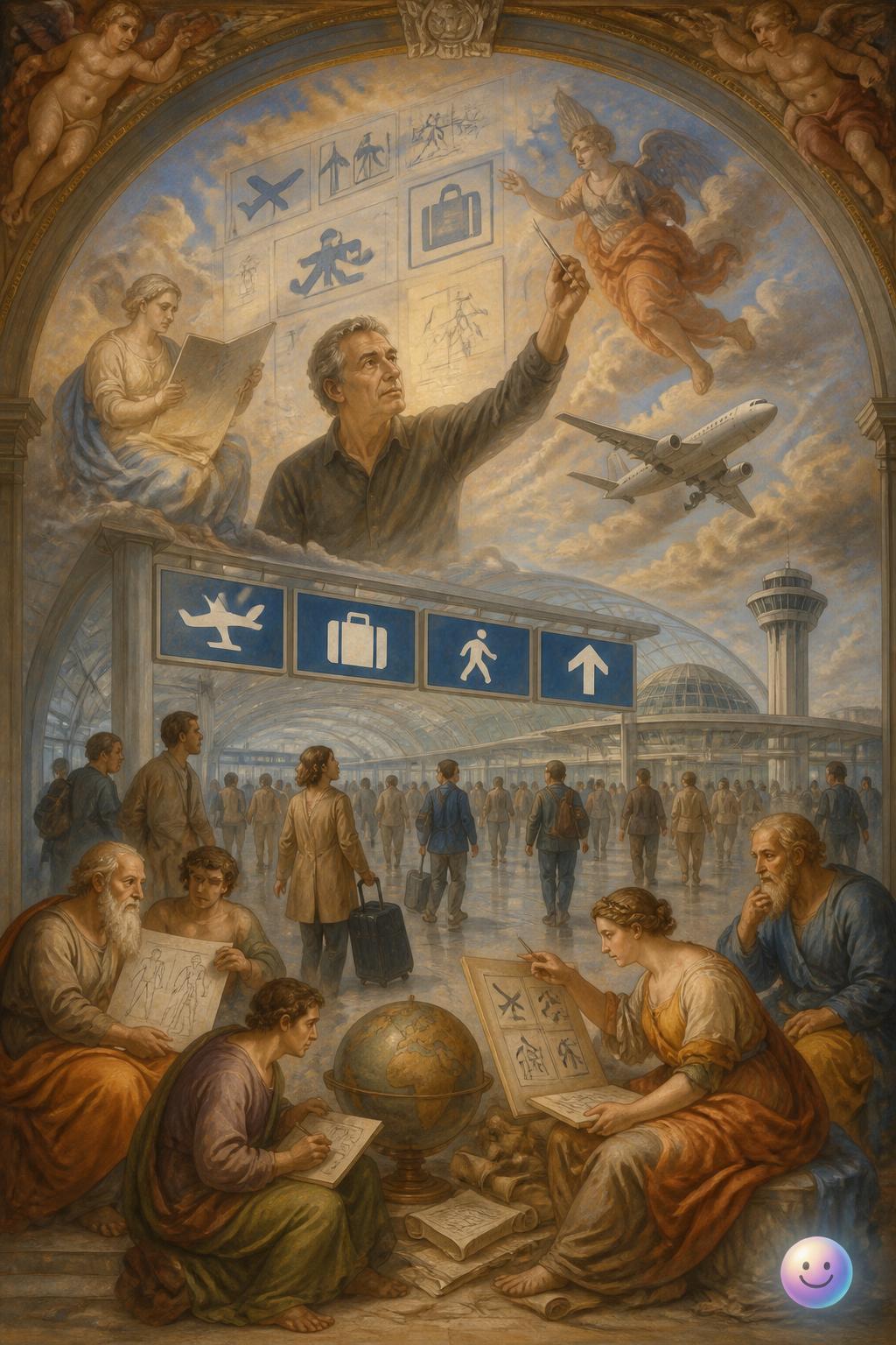
streetspirit Adrian Frutiger designed a highly legible typeface in 1975 specifically to guide travelers through airports.
Which country's iconic, unified road sign system was designed by Jock Kinneir and Margaret Calvert in 1958?
Which typeface was designed in 1937 specifically to remain readable in tiny telephone directory print?
streetspirit Wayfinding Typography
He blurred the letters to test the sight, so they'd stay readable in the night.
streetspirit Margaret Calvert replaced chaotic British road signs with the clear Transport typeface and iconic pictograms. This unified design system eventually spread to countries from Ireland to Hong Kong.
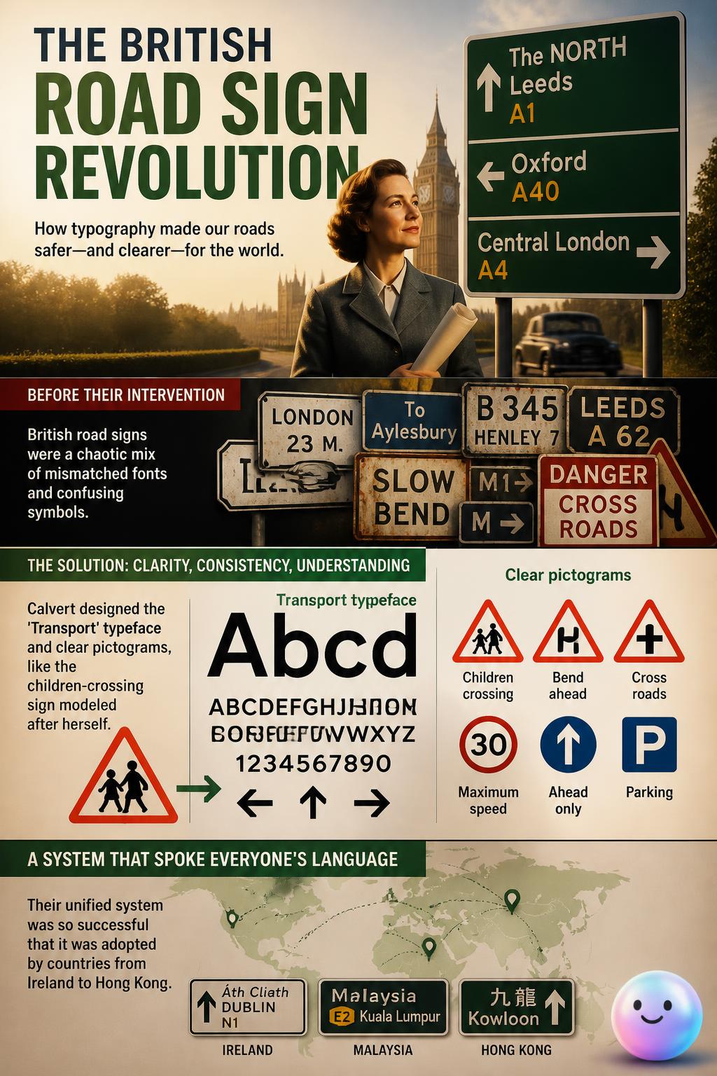
streetspirit In 1958, designers Jock Kinneir and Margaret Calvert redesigned the entire United Kingdom road sign system.
Why were sans-serif fonts historically preferred over serif fonts on early computer screens?
Which famous transit system adopted the custom-designed Johnston Sans typeface in 1916?
Saving ink: Using the font Garamond instead of Times New Roman can save up to twenty-four percent on printer ink due to its thinner strokes.
streetspirit In 2014, teen researcher Suvir Mirchandani proved the US government could save 400 million dollars by switching to Garamond. This thin font uses significantly less ink.
Which designer created the famous Frutiger font for the Charles de Gaulle Airport in 1975?
The process of using spatial and environmental cues to navigate to a destination. Adrian Frutiger designed his eponymous 1968 typeface to optimize wayfinding at Paris's Charles de Gaulle Airport.