
Why the Letter O Is Not a Perfect Circle
Think the letter O is a perfect circle? Discover the optical illusion typographers use to trick your eyes and the secret anatomy of letters.
Chapter 1
The global race to press print
Chapter 2
The secret anatomy and psychology of letters
Chapter 3
Fonts that rule our streets and skies
Chapter 4
The modern battles of digital type
Ch 2 · The secret anatomy and psychology of letters
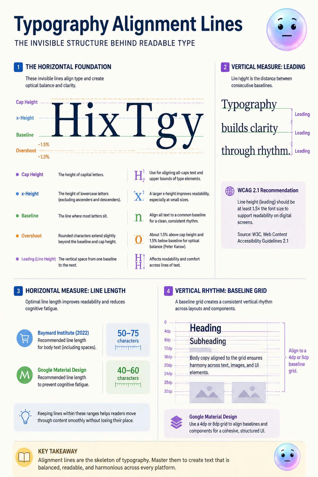
streetspirit The baseline, x-height, cap height, leading, and vertical grids structure text, while rounded letters overshoot these lines by 1.5 percent.
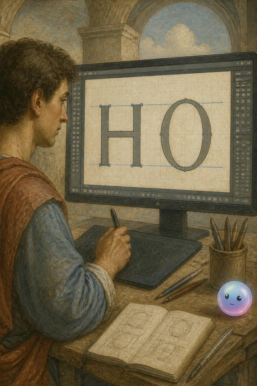
streetspirit Typographic overshoot tricks human eyes into seeing mathematically unequal letters as perfectly balanced.
streetspirit Scribes in eighth-century France replaced messy handwriting with clear, rounded letters and word spaces. This standardized system saved medieval literacy and shaped the modern lowercase alphabet.
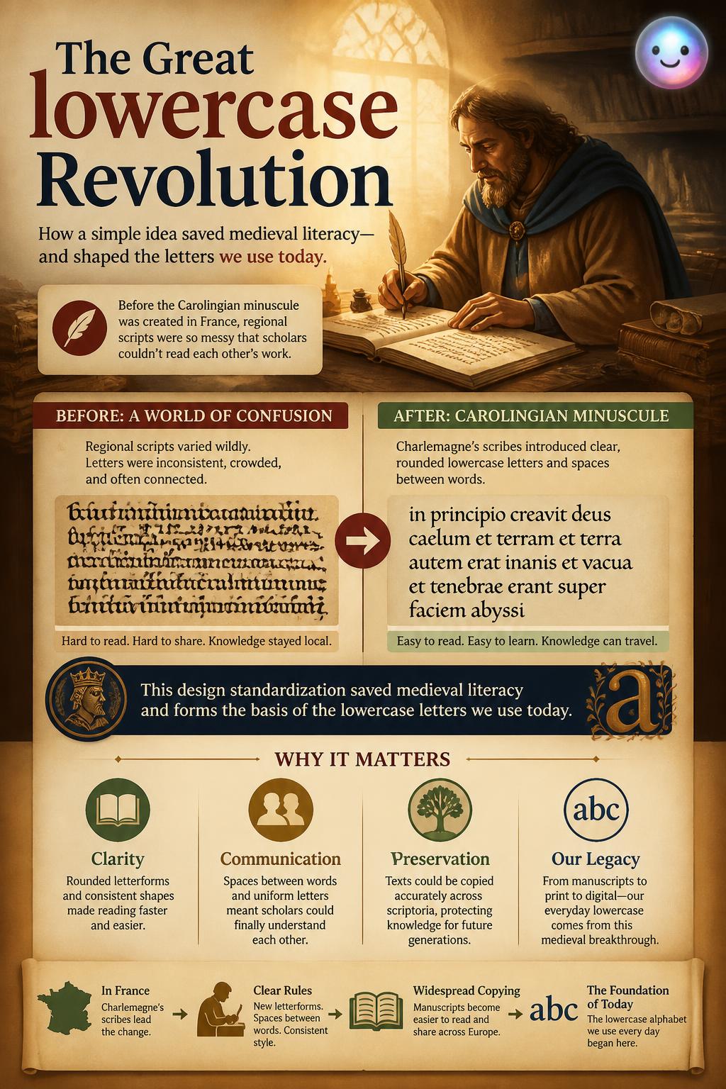
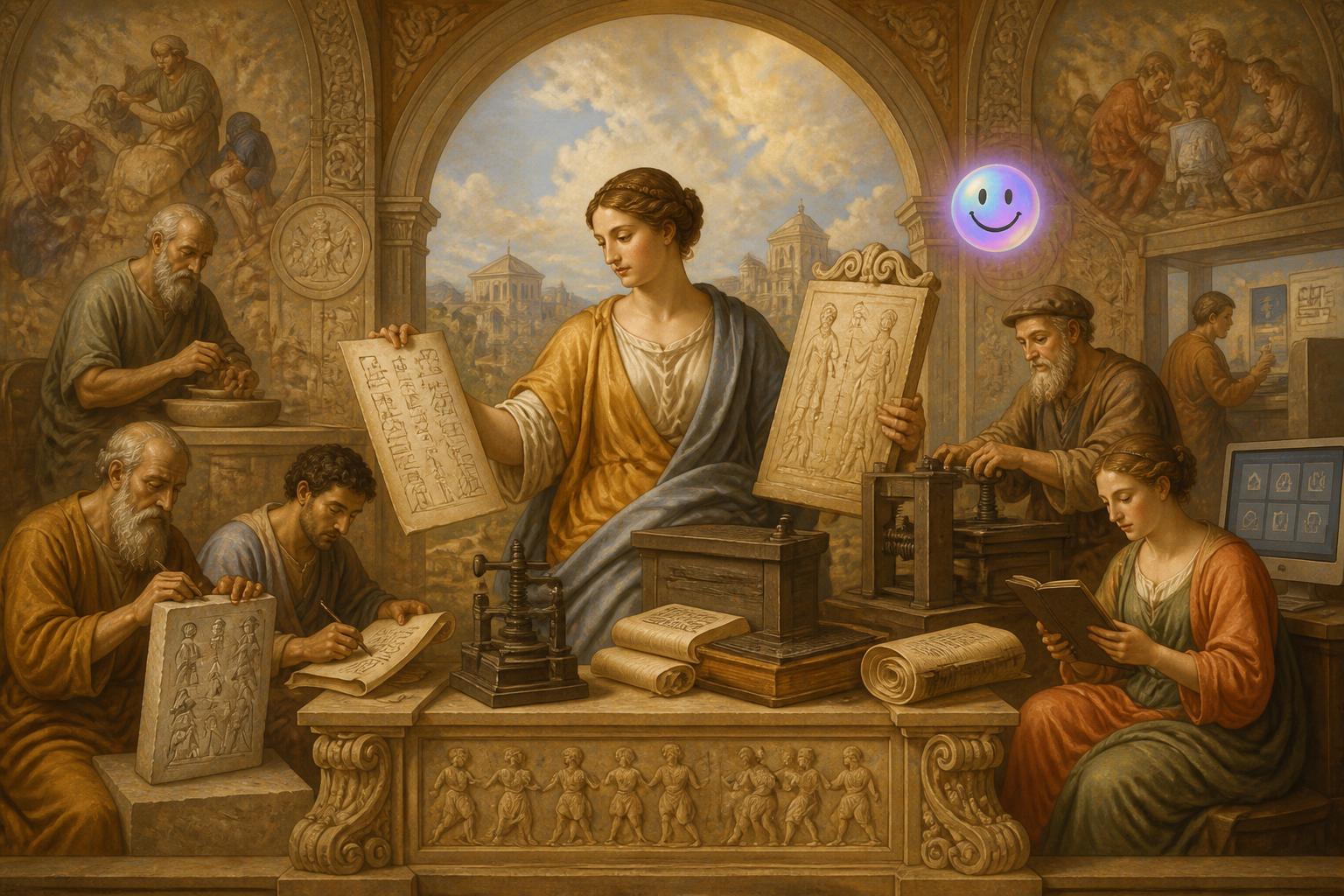
streetspirit In 800 AD, Emperor Charlemagne ordered a standardized lowercase alphabet to unite his vast European empire.
Fun Fact
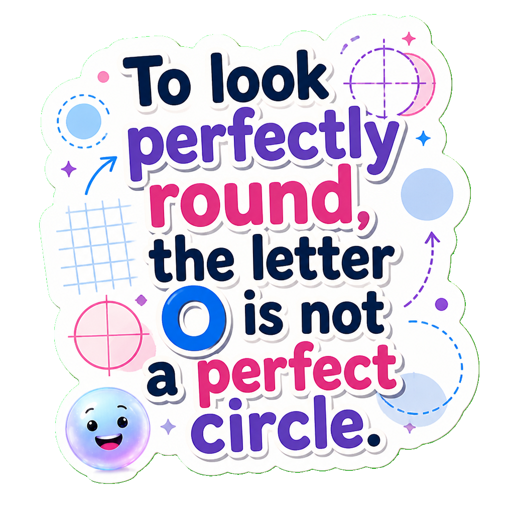
The letter O: The letter O is not a perfect circle; it is slightly taller and wider to fool your eyes into thinking it looks perfectly round.
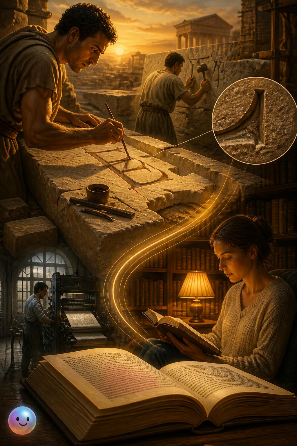
streetspirit Serifs are the tiny decorative lines on letters that originated from ancient Roman stone carvings.
Glossary
serif (noun)
A small decorative line or stroke regularly attached to the end of a larger stroke in a letter. Originating in ancient Roman stone carving, these structural strokes historically evoked feelings of authority, tradition, and trust.
A small decorative line or stroke regularly attached to the end of a larger stroke in a letter. Originating in ancient Roman stone carving, these structural strokes historically evoked feelings of authority, tradition, and trust.
BETA
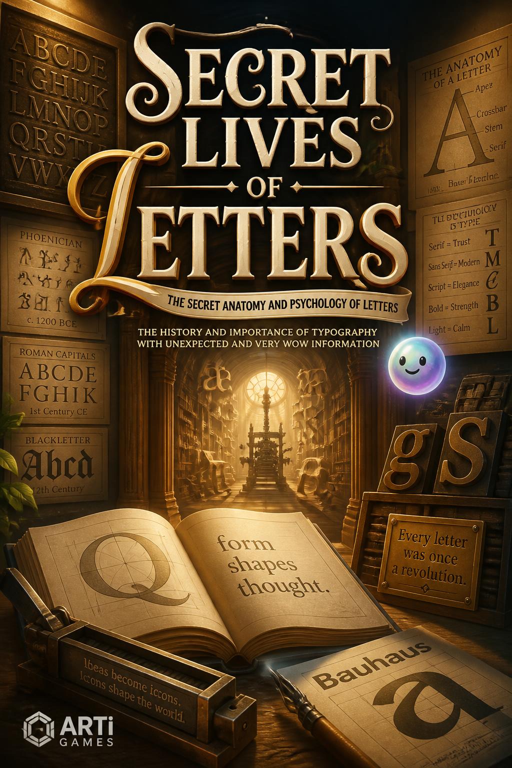
streetspirit Decode the hidden anatomy of letters to discover the wild history behind everyday fonts.
streetspirit Typographers mathematically adjust letter heights on a hidden grid. This precise optical alignment stops text from bouncing so your brain can read effortlessly.
Quiz
What was the original purpose of italic type when it was invented in Italy in 1501?
streetspirit Roman stone carvers painted marble with brushes before chiseling, leaving flared edges that became serifs. These tiny feet still guide your eyes smoothly across printed novel pages today.
streetspirit Type designers use a technique called overshoot to balance letter sizes. Extending curves of the letter O past the guidelines prevents it from looking smaller than the letter H.
Quiz
Why did Emperor Charlemagne commission the Carolingian minuscule script in 800 AD?
Quiz
Why are round letters like 'O' designed to overshoot the top and bottom guidelines?